Why
Health and beauty industry lacks enjoyable and accurate diagnosis for skin and hair care health, leaving users with no quick tech-based solutions.
What
This app uses facial recognition and AI to provide solutions and improve skin health.
How
I adapted Lean UX methodology to achieve high user satisfaction by improving usability and accuracy of the app.
Objectives
The project aimed to address a critical gap in the health and beauty industry: the lack of a technology-driven, engaging, and accurate solution for diagnosing and managing skin and hair health. The specific objectives were:
Introduce AI and Facial Recognition: Enable precise and personalised diagnosis for skin and hair concerns.
Enhance User Engagement: Create an interactive, visually appealing app experience to make skincare routine enjoyable and practical.
Empower Users with Knowledge: Provide tools for tracking health changes and generating actionable insights for improved care.
Features
AI-Based Diagnostics: Advanced algorithms analyse skin and hair conditions, offering actionable recommendations.
Chosen to address the core hypothesis that users value accurate diagnostics for health concerns.Integrated Symptom Checker: A guided tool for identifying and managing health issues.
Included to validate the assumption that users seek intuitive tools to explore specific health triggers.Health Journal: A digital log for users to monitor their skin and hair progress and identify triggers.
Introduced to test whether regular entries would help users discover patterns and improve self-care.Customised Product Suggestions: Personalised product recommendations tailored to individual needs and preferences.
Added to determine if tailored guidance improves user trust and app engagement.Inclusive Design: Utilises diverse skin tones and intuitive animations to enhance accessibility and user comfort.
Created to test the hypothesis that a visually appealing and inclusive interface boosts overall satisfaction.
Initial Ideas Not Pursued:
Several potential features were considered but not implemented in the final prototype:
AR Visualisations: Allowing users to "try on" skincare results in real-time.
Discarded due to complexity and focus on diagnostic functionality.Community Forum: A social feature for users to share skincare tips and experiences.
Set aside to maintain privacy and focus on personalised solutions.Gamification Elements: Adding rewards for routine maintenance and tracking progress.
Omitted to keep the app professional and science-driven.
These ideas, while interesting, were deferred to prioritise features aligning directly with core user needs and Lean UX hypotheses.
My Approach
Problem Identification and Research
The initial phase focused on understanding user pain points through surveys, which revealed a strong demand for a fun, reliable app addressing unmet skincare and haircare needs. Key challenges included balancing trust, usability, and accuracy in integrating AI with sensitive features like facial recognition.
Hypothesis Development
Through prioritised assumptions, a hypothesis emerged: users would engage with the app if it offered accurate diagnostics, personalisation, and a seamless experience. This included testing the safety perception of facial recognition and evaluating the diagnostic precision of AI.
Design Process
The development adhered to the Lean UX methodology, moving through iterative cycles:
Ideation and Conceptualisation: Worst-case scenario exercises provided unique insights into essential app features and security elements.
Prototyping: Transitioned from paper sketches to digital wireframes and ultimately high-fidelity prototypes, ensuring the design was user-centric at every stage.
Visual Aesthetics: Emphasised a professional yet inclusive look, incorporating warm colours and minimalistic design elements to resonate with a broad audience.
Testing and Validation
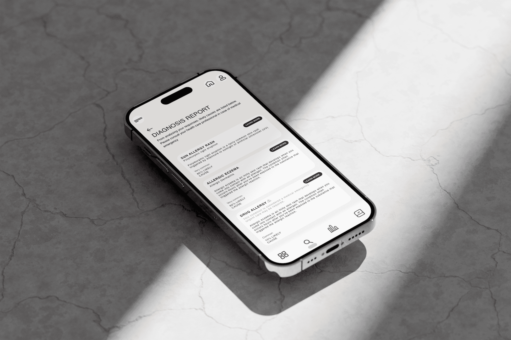
User testing involved task-based evaluations, identifying areas of improvement such as the visibility of tracking features and enhancing diagnosis report visuals. Results informed refinements, making the app more intuitive and visually compelling.
Result
User Satisfaction: 83% of testers rated the app as engaging, functional, and enjoyable.
Task Completion: 100% of participants successfully navigated primary features like sign-up and symptom checker.
Improvements Identified: Enhanced diagnosis reports and feature visibility to address usability challenges.
Diagnostic Accuracy: Leveraged AI to achieve reliable health insights through facial recognition, validated through iterative testing cycles.
Retrospective
This project became an unexpected learning experience—a journey from uninspiring beginnings to a 'what not to do' UX design masterclass. In this blog, I adopt a (slightly) humorous approach to reflect on the lessons learned and explore the areas where I could have improved, offering insights for future projects.


